
Sunday, April 17, 2011
Star Plots
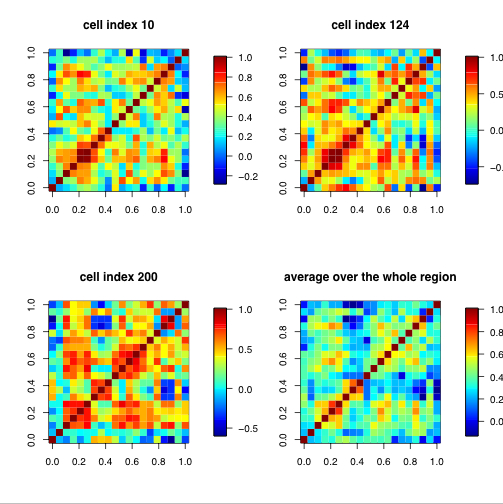
Correlation matrix
Similarity Matrix

Similarity matrices are used in aligning sequenced information such as higher scores are given more similar characteristics while lower scores are given dissimilar characteristics.Similarity matrices show a strong similarity to their counter matrices: distance and substitution. The above matrix is of the the Beatles song Hey Jude. The dark blue lined indicate similarity when lyrics are repeated. The area of unconcentrated shading is during the instrumental parts of the song.
Stem and Leaf Plot

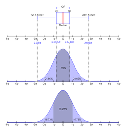
Box Plot
Histogram

Parallel Coordinate Graph

Subscribe to:
Comments (Atom)