
Sunday, April 17, 2011
Star Plots
Correlation matrix
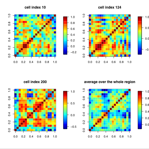
Similarity Matrix

Similarity matrices are used in aligning sequenced information such as higher scores are given more similar characteristics while lower scores are given dissimilar characteristics.Similarity matrices show a strong similarity to their counter matrices: distance and substitution. The above matrix is of the the Beatles song Hey Jude. The dark blue lined indicate similarity when lyrics are repeated. The area of unconcentrated shading is during the instrumental parts of the song.
Stem and Leaf Plot

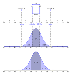
Box Plot
Histogram

Parallel Coordinate Graph

Trangular Plot

Windrose

Climograph

A climograph is a depiction of the monthly precipitation and temperature in a selected place. In the above climograph, precipitation is shown by the bar graph while the line graph depicts temperature in Memphis, Tennessee.
Population Profile

Scatter Plot

Index Value Plot

Lorenz Curve

Bilateral Graph
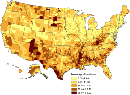
Nominal Area Choropleth Maps

Unstandardized Choropleth Map

Standardized Choropleth Maps

A choropleth map becomes standardized when the variable values are determined using ratios, rates, percentages or proportions. The above image is of Access to safe drinking water in Nepal. The difference of intensity of color demonstrates the differences in phenomenon in rendered areas.
Univariate Choropleth Maps
Wednesday, April 13, 2011
Bivariate Choropleth Maps

Tuesday, April 12, 2011
Unclassed Choropleth Maps

Sunday, April 10, 2011
Classed Choropleth Maps

Range Graded Proportional Circle Map
Continuously Variable Proportional Circle Map

DOQQ
Currently, Color infrared and black & white DOQQ projections are available.
DEM

Saturday, April 9, 2011
DLG
A Digital Line Graph represents cartographic information and are usually derived from USGS maps. DLG's are distributed in three scales: Large, intermediate, and small.

LIDAR

Doppler Radar

Black and White Aerial Photography

Infrared Aerial Photo

Thursday, April 7, 2011
Cartographic Animations

Cartographic Animation is a visualization tool used to help demonstrate change. This change is categorized into two different ways:
Temporal: Change over periods of time
Non-Temporal: Variables in a single time period.
Most cartographic animations depict change temporally- Over time.
Statistical Maps

The Statistical Map (aka the distribution map) uses graphics do display information pertaining to a specific subject. The graphics typically represent how often something takes place in a geographical location. The statistical map above demonstrates the difference in statutes pertaining to the amount of parent involvement required for an abortion in each state.
Wednesday, April 6, 2011
Cartograms

A Cartogram Map re-sizes a given territory depending upon the variable being mapped such as land area or population. Cartograms are great for mapping one desired variable and nothing else. The map on the top reflects the amount of deaths in 2002 from preventable diseases while the map on the bottom reflects the countries size relative to its population.
Flow Map

Isopleths

An Isopleth is essentially an Isoline. Lines or contours connect natural occurences in equal amounts in any given area. these contours portray a 3rd dimention on a map.

Isohyets

Tuesday, April 5, 2011
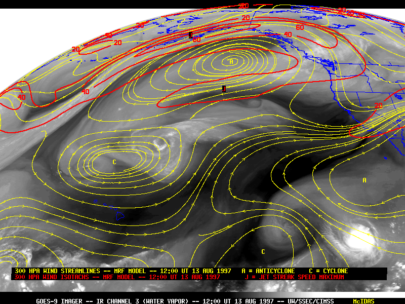
Isotachs

Isotachs (together with Isolines) connect points of equal wind speeds on a natural surface.
Isobars
Isoline maps

http://legacy.sfei.org/ecoatlas/GIS/MapInterpretation/MapsandScales.html
Isoline Maps show patterns that when displayed on a 2-dimensional map display a 3-dimensional (usually overhead view) of environmental surfaces. Dimension in the map above was accomplished by connecting points of equal value (Isolines) to give the reader a better understanding of where elemental change takes place. This interpolation differentiates higher value from lower value and measures several elements of the natural environment such as elevation, wind speed, and rainfall to name a few.
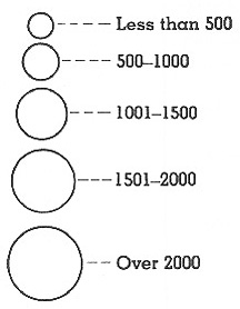
Proportional Circle Maps

http://www.geog.ucsb.edu/~jeff/gis/proportional_symbols.html
A Proportional Circle Map uses circles to represent a total data value within a geographical area on a map. Circles are used over other shapes because statistical information can be more accurately scaled to size on a map using the radius of a circle to represent an area. The bigger the circle, the bigger the geographical location the circle represents. To the human eye, circle proportion is an easy way to understand and differentiate scaled values on a map.
Subscribe to:
Comments (Atom)